OnwardBrand Identity


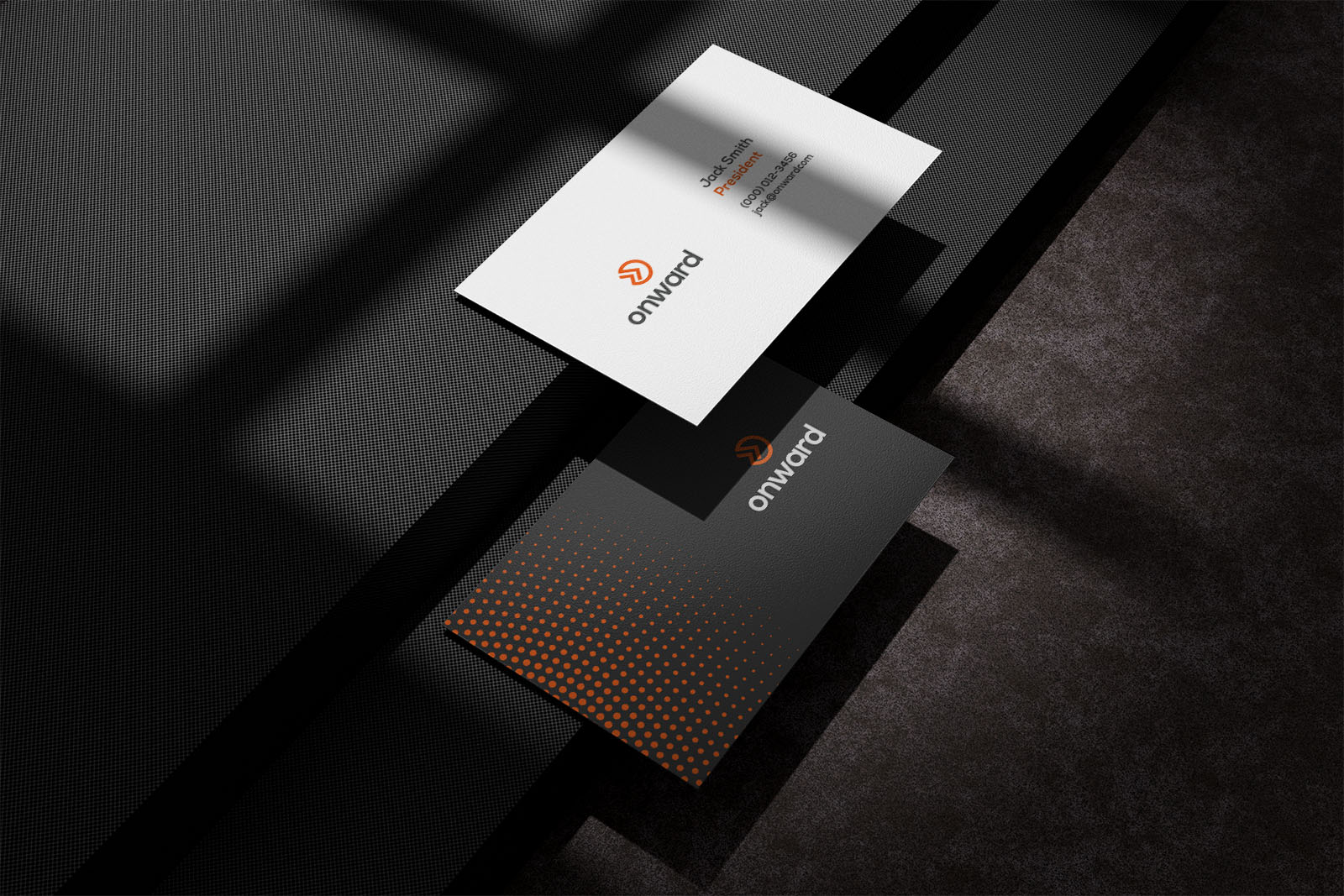
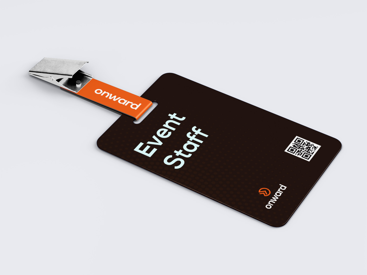
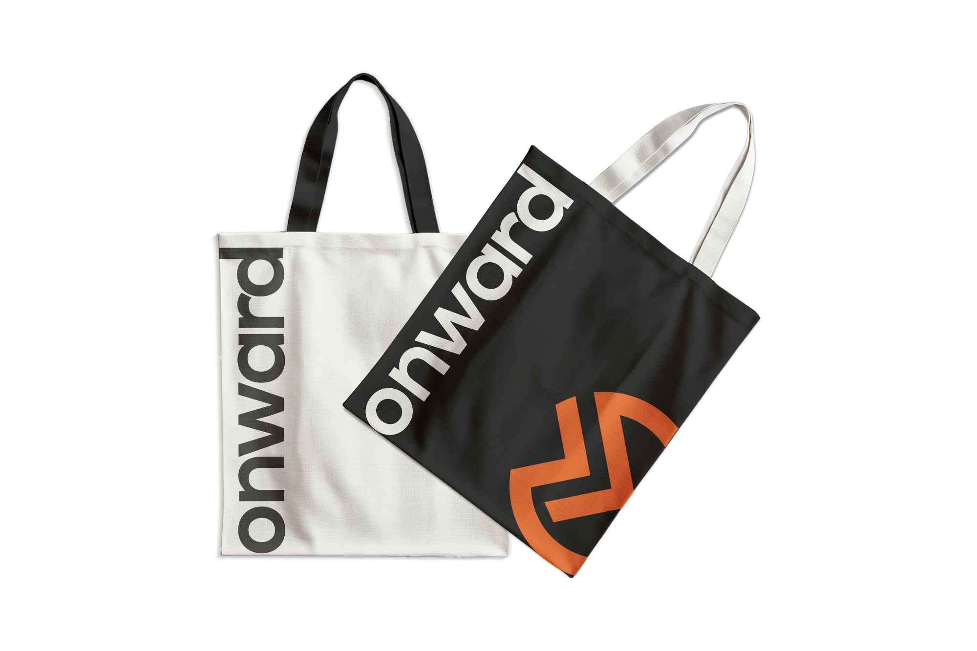
Create a brand identity that feels warm and welcoming, while remaining modern and minimal. Reflects progress and movement without being overly corporate. Appeals to a broad audience spanning various ages, ethnicities, and backgrounds. Can flex across digital, print, and event-based touchpoints.
Client
Onward Gatherings
Role
Brand Designer
Date
Jun 2020
Deliverables
Brand Identity
TOT BAGS

The Solution
To bring Onward Gathering’s vision to life, we developed a holistic brand identity system rooted in clarity, warmth, and forward motion. Our solution was built around three key elements:
1. A Symbol of Movement and Belonging
We created a versatile logomark that combines a a circle and double arrows — representing hope, transformation, and intentional journeying. This symbol became a visual metaphor for the brand’s mission: helping people move forward together.
2. A Calming, Inclusive Visual Language
We built an earthy color palette and paired it with elegant typography to evoke a sense of peace, welcome, and modernity. The design system uses organic shapes and abstract paths to visually reinforce the themes of flow, movement, and connection.
3. A Consistent Brand Voice
We established a voice guide that’s grounded, encouraging, and human. From social media captions to event programs, all messaging is infused with warmth and intentionality — helping every touchpoint feel personal and aligned with the brand’s values.